%20(1).svg)

.jpg)
When presenting data visually, the goal is to make it easy to understand quickly. I’m sure we’ve all seen reports or charts that might look pretty, but are seemingly impossible to understand. Or, perhaps the opposite, the chart is easy to understand but the format is a bit outdated and you might not want to share it with your stakeholders.
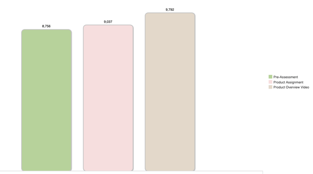
We’re listening! This month we are happy to announce a new look for our charts. Our goal was to make your reports more modern and cleaner, therefore easier to read and understand.
Here’s the new look:
And here’s the old look:
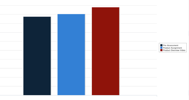
The new formatting has been applied to all out-of-the-box charts. If you are creating a new chart, as I did with the one above (showing activity completion), you can apply the new formatting by following the instructions in our Case Study: Chart Styling for Bar, Column, Pir, Scatter, Line and Area Charts for bar and column charts. It takes about 2-5 minutes to make the changes.

.svg)
%20(1).svg)